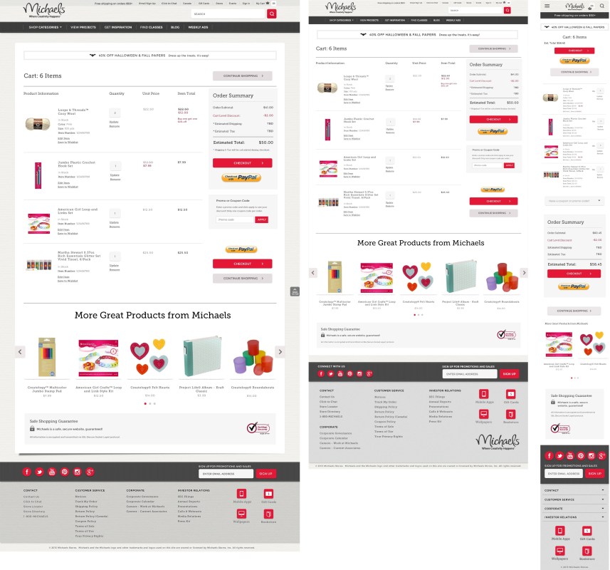
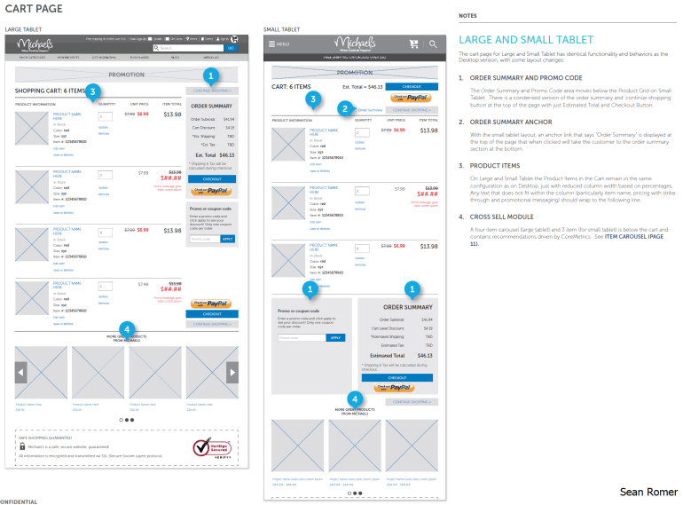
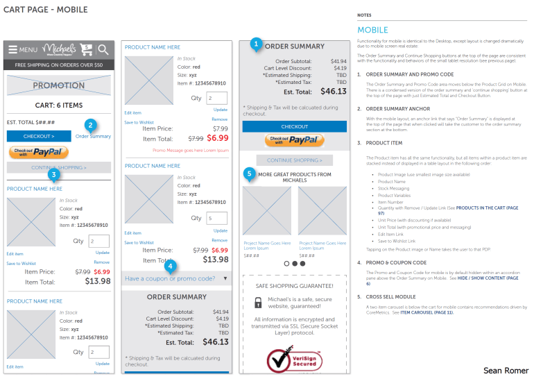
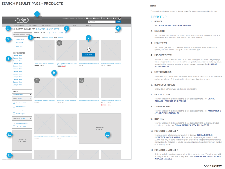
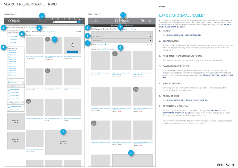
There were four layouts for the responsive redesign of the Michaels digital experience:
- Desktop grid with five columns (for resolutions 1260px and higher)
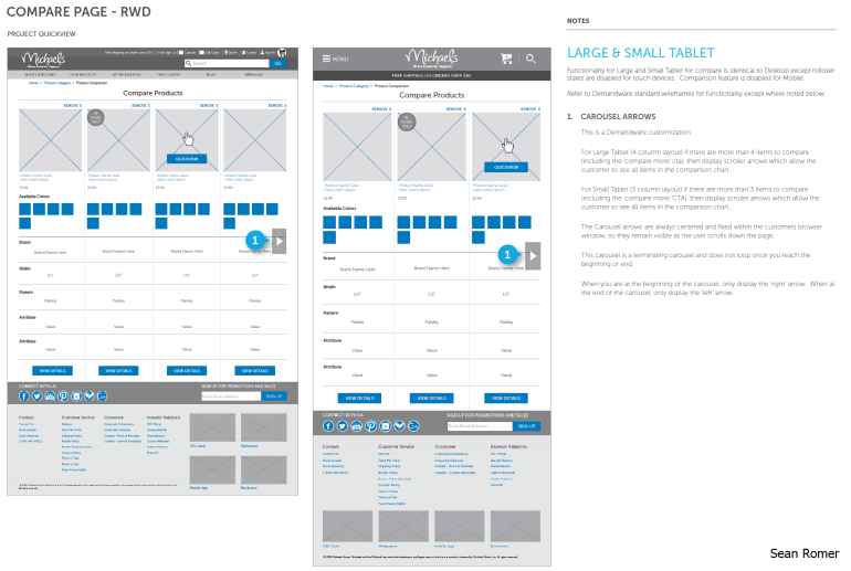
- Large Tablet grid with four columns (for resolutions 1259px-1024px)
- Small Tablet grid with three columns (for resolutions 1023px-768 px)
- Mobile grid with two columns (for resolutions 767px-320 px)
Four layouts accommodated a wide range of device viewports.
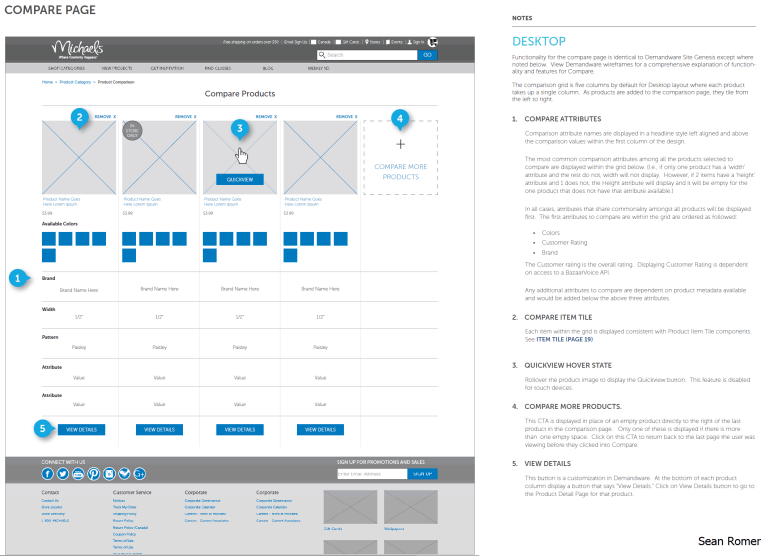
Michaels sells a variety of arts and crafts products.
See the results at http://www.michaels.com/
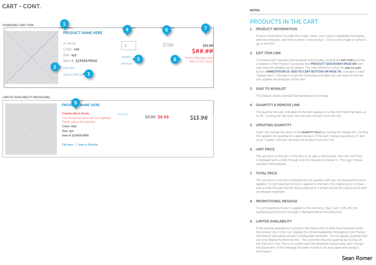
SELECT WIRE FRAMES

 Sean Romer